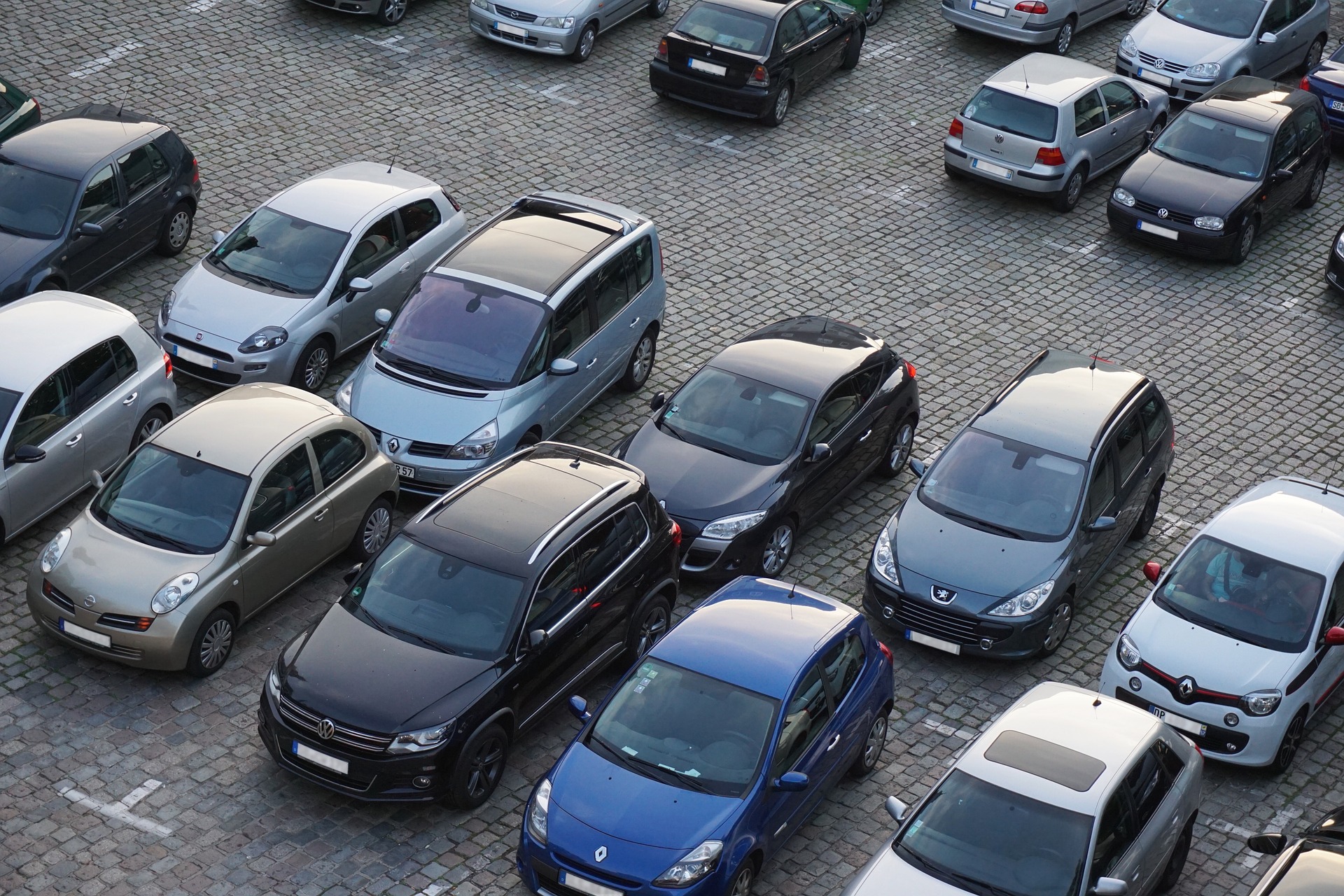
Lack of Design Thinking in Supermarket Car Parks

I’m convinced that there’s no thought to place of people in the design of most supermarket car parks.
Poor Design
I’ve just been to a great example of poor design.
When driving in, you turn off the main road to a roundabout. At this roundabout, you turn right, away from the store, to the main car park. You can turn left, towards the store, to the disabled and parent+child spaces. There is no path between the main car park and the store. So at the roundabout, we also have people walking from their car to the store and back from the store, laden with shopping, to their cars. All those people also have to walk through the disabled and parent+child car park. Even in that car, the only two differences are that the spaces are wider and closer to the store. Once you’re out of your car, there is no pathway or walkway, even as disabled or with a child; you’re straight into route of cars (with their drivers looking for spaces).
More Common Example
I’ve always wondered why every supermarket car park has the access road running right past the front of the supermarket pedestrian entrance. From a day-to-day safety perspective, it doesn’t make sense. It forces drivers to drive their cars past pedestrians trying to cross the road from the car park to the store. It feels like lazy or shoddy design. I hope that it’s a law or bye-law regarding providing access for emergency vehicles. However, even if that were the case, is the road right in front of the superstore the correct approach?
Attitude
What’s missing here is the realisation that we’re all pedestrians. Whether we drive or not, at some point, we’re walking or moving with the aid of a wheelchair. That element has been forgotten and instead, the focus has been placed on the car, not the people.
Cars can’t speak for themselves, they can answer questions in a design sprint. Only people can. And there will always be more people than cars going to supermarkets. At least, until automation becomes more prevalent.
Can you imagine what a car park would look like if it were designed with people in mind first? Better walkways, better trolley parks (self-driving trollies?), more visible paths splitting pedestrians and cars, straight walkways that go from the store to where people want to get to (as opposed to the current approach of pathways where it’s least awkward for cars).


Recent Comments