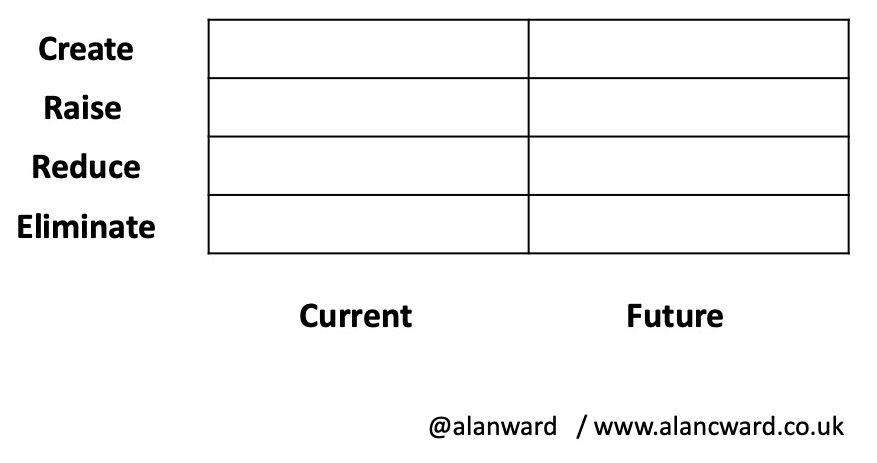
ERRC as an 8 box model

Blue Ocean Strategy includes a concept of an ERRC diagram to cover the following strategic decisions:
- Eliminate
- Reduce
- Raise
- Create
Graph?
It’s usually depicted as a linear graph where the authors of each ERRC decide which of the features of their product (or indeed which products) should fall into which section of the graph.
The issue is that it’s not linear, there is no meaning to a point between the sections. Nor is there a meaning to the line that connects the dots.
Instead it’s actually a 4, 8, 12, 16 box model, etc.
16 box model
So treating it in the same way that we treat the 4 box models, we then start to populate. Along the horizontal x-axis, we have the functions, the capability or the stage of customer journey, with the latter being the more common useful. The vertical y-axis includes the options of ERRC.
We populate the cells of the table with the part of the experience we want to change. For the x-axis in the example, I’ve chosen a few of the customer journey stages that we may see with ordering a mobile phone online. This isn’t that different the ERRC diagram that you’ll see in BOC. The main difference is that it doesn’t present it as a graph, since it never was a graph.
8 box model
There is an alternative way of looking at this with an 8-box model. In this version, vertical is again the options for ERRC, but the horizontal represents current and future.
The point about this one is that we can highlight which elements that we’re going to change. For instance, we may want to raise the packaging used in the delivery from basic brown parcel paper wrapping to a more luxury packaging material. There’s no reason we have to restrict ourselves to just Current and Future; we could insert intermediary stages.


Recent Comments